Every trends article you'll read this year has the same problem. It lists twenty things, praises all twenty, and takes a position on none of them. VR shopping sits next to dark mode like they're equally likely to matter to your business. They're not. This one works differently. These are the web design trends 2027 will actually be judged by, each with a verdict: adopt it, watch it, or skip it. The calls come from an agency that ships client sites every month, not from a futurism deck. Some of the trends getting the loudest hype right now are, in our view, expensive dead ends. We'll name them.
Web design trends 2027, scored
The short version, before the arguments:
AI-assisted design workflows. Designing for AI agents and answer engines. Type-led layouts. Performance budgets. Accessibility as a requirement, not a feature. Dark mode done properly. Motion that respects the reader.
Glass surfaces. Conversational interfaces on content sites. Personalisation beyond the basics.
Emotion-sensing UI. VR websites. Scrolljacking. Auto-opening chat widgets. The 12MB hero video your competitor just shipped.
Now the reasons.
AI builds the first draft now. Taste is the job.
The biggest shift in modern web design isn't visual at all. It's who does the first 70% of the work.
AI web design tools like v0, Lovable, Framer's AI features and Figma's generation tools now produce a working layout from a paragraph of text. Not a mockup. Working code, responsive, with plausible spacing and a colour system that doesn't embarrass anyone. Two years ago that took a junior designer three days. Now it takes four minutes and a decent prompt.
Here's what the hype posts get wrong about this: they frame it as designers being replaced. What's actually happening is that the floor rose and the ceiling didn't move. Anyone can now produce a competent-looking site. Which means competent-looking is worth nothing. The value moved up a level, to the decisions the tool can't make. What should this page argue? What gets cut? Why does this button say "Get a quote" instead of "Learn more"? An AI will happily generate either. It has no opinion about your business. That's still your job, or your designer's.
We felt this on our own work. When we rebuilt the GIT Infosys landing pages this year on Tailwind, the components came together faster than any project we'd done, because generation handled the scaffolding. The hard hours went where they should: message, hierarchy, what to leave out. The build got cheaper. The thinking didn't.
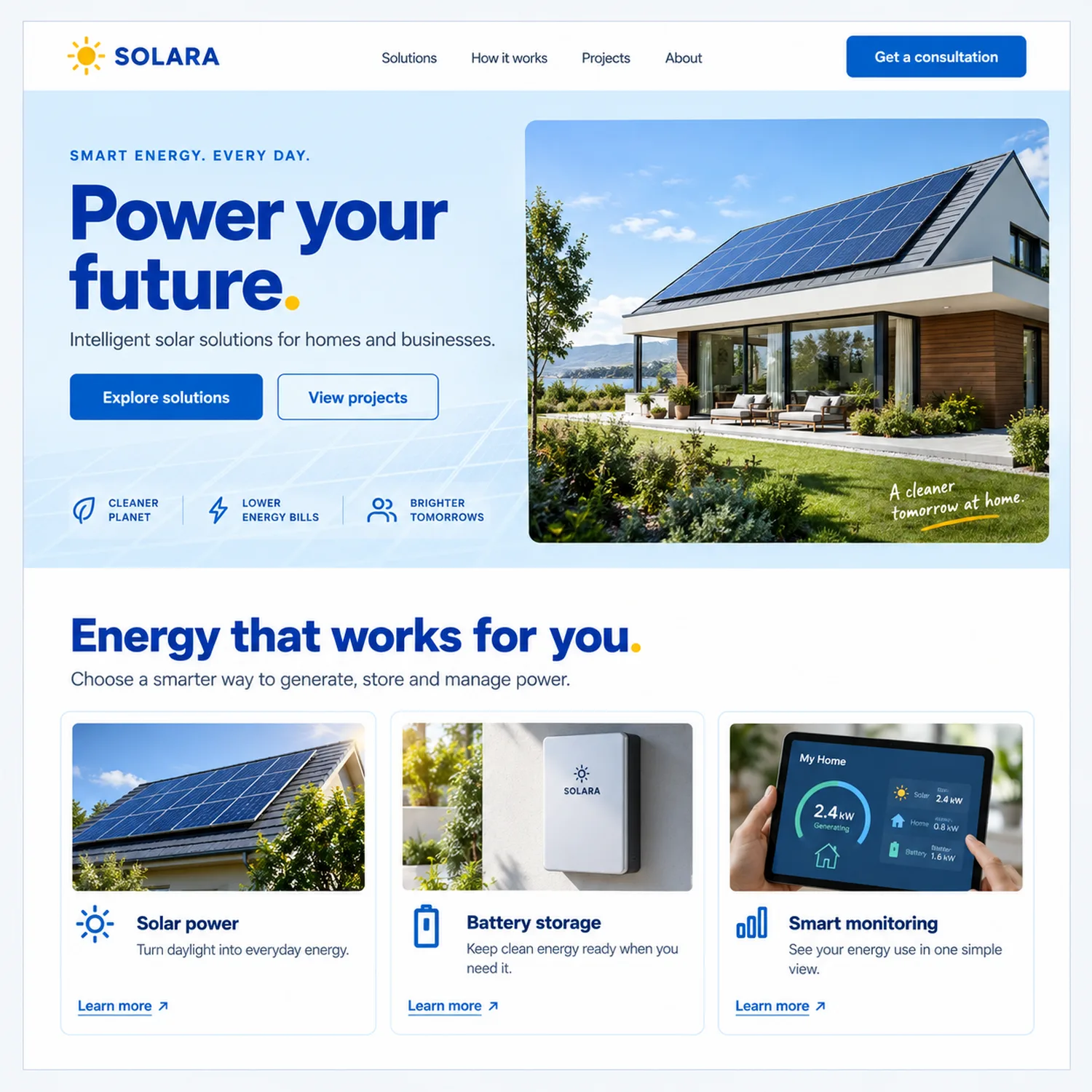
SOLARA The competent default. Blue and white, rounded cards, a three-up feature row, a photograph of a happy house. Nothing on this page is wrong, and that is exactly the point. Every part of it can be generated in four minutes, which is why competent stopped being worth paying for and the argument moved to what the page actually says.
The practical verdict for 2027: adopt AI in the workflow, aggressively, and redirect the saved hours into strategy and content. If your agency's quote for a basic brochure site still assumes 2022-era build hours, ask them why — and check it against what a website actually costs to build in India today.
One warning inside the adopt column. AI-generated sites have a look. The same fonts, the same gradient blobs, the same three-column feature grid with the same lucide icons. Users are starting to recognise it the way they learned to recognise stock photos of people laughing at salads. Use the tools for speed, then spend human effort making the result look like it belongs to you and nobody else. Which leads to a bigger point about how 2027 sites will look. We'll get there.
Your next visitor might not be human
This is the trend the ranking articles barely touch, and it's the one we'd bet on hardest.
A growing share of your traffic in 2027 won't be a person with a mouse. It'll be an AI assistant reading your site on someone's behalf. Someone asks their assistant to find a web design company in Jaipur, compare three quotes, and summarise the differences. The assistant visits the sites, reads them, and reports back. The human may never see your homepage. Your hero animation plays to nobody.
That changes what "design" means. A site now has two audiences: the person, and the machine reading for the person. Designing for the second audience looks like this:
Clean heading structure that states what each section is, because agents navigate by headings. Real text instead of text baked into images, because baked-in text is invisible. Schema markup for your services, prices, locations and reviews, because structured data is the difference between being quoted accurately and being skipped. Answers stated plainly on the page: what you do, where you work, what things cost, how to contact you. If an agent can't extract those in one pass, you lose the recommendation to a competitor whose site is more readable.
There's also a small convention gaining ground called llms.txt, a plain file that gives AI systems a map of your site's pages and what each one covers. It costs an hour to produce. Whether it becomes a standard or not, the thinking behind it is the trend: make your site easy for machines to summarise truthfully.
Here's the difference in practice. The old services page opens with "We craft bespoke digital experiences that transform your brand's journey." An assistant reading that learns nothing it can repeat to a buyer. The 2027 version opens with "GIT Infosys designs and builds websites for businesses in Jaipur and the UK. Brochure sites, e-commerce stores and web apps, from planning to launch, with prices published on this page." A machine can quote that. So can a human telling a colleague about you, which was always the real test of clear copy. Agents just made vagueness measurable.
.webp)
TIDAL Built to be quoted. Every claim is a plain sentence: what the tools do, what the three capabilities are, what happens next. Headings state their own section, and nothing that matters is baked into an image. Read it aloud and it still makes sense, which is the same test an AI assistant applies when it summarises you for a buyer.
None of this fights with human-first design. A page an agent can parse cleanly is usually a page a tired human on a phone can parse cleanly too. Same discipline, two payoffs. It also overlaps almost entirely with search — if you are choosing where to spend, our guide to the types of digital marketing covers how this sits alongside SEO and paid channels.
Adopt, this quarter, before your competitors read an article like this one.
Interfaces that answer back
The search box is quietly turning into an ask box. Instead of typing "refund policy" and scanning ten results, users increasingly expect to type "can I return this after 30 days?" and get a sentence back. E-commerce sites, documentation sites and support sections are all moving this way, and by 2027 a dumb keyword search on a large site will feel dated.
.webp)
PURE Where an ask box earns its place. This is a catalogue, so finding is the job: filter chips across the top, one clear message per product, colour options visible before the click. Put a conversational answer layer on a site like this and it pays for itself. Put one on a five-page brochure site and it is a costume.
Adopt this where you have enough content to justify it. A 400-product store, yes. A five-page brochure site, no. A chat-style answer layer on a site with five pages is a costume.
Now the part of this trend we'd tell you to walk past. Several agencies are pitching "emotion-sensing UI" for 2027: interfaces that read your face or your biometrics and adjust the page to your mood. You'll see it in trend lists dressed up as the future of personalisation. Ask the obvious questions. Which users are switching their cameras on for a brochure site? Under what privacy law does that data get processed? What happens when the model decides a bored face needs a popup? It's a demo, not a direction. Personalisation in 2027 that actually ships looks boring by comparison: remembering a returning visitor, resuming a half-finished form, showing the Jaipur office number to someone browsing from Jaipur. Do the boring version. It converts. The face-reading version gets you a privacy complaint and a conference talk.
The 2027 look
The visual and UI design trends of this cycle are downstream of one force: everything generated looks the same, so brands are paying for whatever doesn't.
Type is the design
The strongest sites going into 2027 treat typography as the main visual event. One oversized, characterful headline face. Generous size contrast between heading and body. Almost no decoration competing with the words. It photographs badly in a trends listicle and works brilliantly in real use, because it loads fast, scales to any screen, and can't be mistaken for a template.
.webp)
FLUX Type carrying the whole page. Acid green, black condensed capitals at poster scale, and almost nothing competing with the words. Cover the 3D object and the design still stands, because the typography is doing the work. This is the cheapest route to looking like nobody else, and it loads in a fraction of the weight of a video hero.
Variable fonts make this cheaper than it used to be. One file covers every weight and width you need, so you get typographic range without the old penalty of loading six font files. Kinetic touches, type that shifts on hover or as you scroll, carry the movement budget on a lot of 2027 sites instead of heavy imagery. A little goes a long way. Type that never sits still is a gimmick by week two.
.webp)
AER The same idea with the volume down. One light weight, enormous contrast between heading and body, and space doing the job that boxes and borders usually do. Restraint at this level is not an absence of design, it is the expensive version of it, and it reads instantly on a phone.
Glass, grain, and the anti-template look
Glass surfaces are back, and this time it's not a Dribbble fad. Apple pushed a translucent glass language across its platforms in 2025, and as usual the rest of the industry followed. Frosted panels, blur, light catching edges. It can look genuinely premium.
It can also be an accessibility trap, which is why it sits in our watch column rather than adopt. Text over a translucent panel over a busy photo fails contrast checks constantly. If you want the glass look, test every panel against the darkest and lightest content that can appear behind it, and keep body text on solid ground. Decorative glass, yes. Load-bearing glass, careful.
The other visual current runs the opposite direction from glossy: grain, texture, hand-drawn marks, slightly off-grid layouts, photography that looks like a person took it. Call it the anti-template look. It exists because AI output is polished by default, so polish stopped signalling effort. Imperfection now reads as proof a human was here. Nostalgic design rides the same wave, old lettering styles, film grain, interfaces that nod at hardware people miss. Used with intent, this stuff builds warmth no gradient ever will. Used as a costume by a brand with nothing behind it, users smell it immediately. If you want to build the craft in-house, our graphic design course in Jaipur covers the fundamentals this look depends on.
.webp)
MYCEL The anti-template direction. Cream and forest green, a serif with a real italic, an arch instead of another rectangle, and a peach panel that no generator would have chosen. It looks like a person with an opinion made it, which is the whole point now that polish is free and no longer signals that anyone tried.
Dark mode, meanwhile, has stopped being a trend and become table stakes. The 2027-specific detail is doing it properly: honouring the visitor's system preference automatically instead of hiding a toggle in the footer, and designing the dark palette on purpose rather than inverting the light one. Modern CSS makes respecting the preference a few lines of work. There's no excuse left.
Motion that respects the reader
Animation in 2027 splits cleanly into two camps.
Camp one: motion that explains. A panel that slides in from where you tapped, so you understand where you are. A number that counts up when it enters the viewport. Page transitions that fade sections smoothly instead of the hard white flash between loads, something browsers can now do natively with the View Transitions API rather than through a heavy JavaScript library. This kind of motion earns its place. It gives interfaces the smoothness people know from good mobile apps.
.webp)
PULSE Motion that explains rather than performs. Every moving part here maps to something the listener is doing: a play button, a progress bar, a player that stays put as you browse. That is camp one. The same page with panels flying in from four directions on every scroll would be camp two, and would measure worse on the metric Google now grades.
Camp two: motion that performs. Scrolljacking that takes the wheel away from the user. Preloader screens with a percentage counter, on a five-page site, in 2027. Elements flying in from four directions on every scroll. This camp gets your site into an awards gallery and your bounce rate into trouble.
Two rules keep you in camp one. Every animation answers "what does this help the user understand?" or it goes. And every site respects the reduced-motion setting people turn on in their operating system, some because animation makes them ill, which browsers expose to your stylesheet in one media query. Skipping it isn't edgy. It's careless.
Quick verdicts on everything else
The trends above are the ones we'd build a 2027 strategy around. The rest of the latest web design trends list deserves a ruling too, because you'll be pitched all of it.
The dashboard-style layout of unequal tiles, borrowed from Apple's keynote slides, is everywhere for a reason. It lets one screen hold six messages without looking like a spreadsheet, and it maps cleanly onto responsive breakpoints. The failure mode is filling tiles because the grid has holes. Every tile earns its spot with a real message or the layout collapses into decoration.
.webp)
NEXUS A tile layout that earns its tiles. The board underneath the headline is a real product view, and each panel carries one genuine message instead of filling a hole in the grid. The handwritten notes in the margin are the other trend on this page: a deliberate imperfection dropped into an otherwise geometric layout.
Pages where the story unfolds as you scroll, images pinning and swapping, numbers animating in, work genuinely well for a single complex product, a case study, an annual report. Indian real estate brands have used it well to walk buyers through a project. As the default pattern for a whole site, it's slow to build, heavy to load, and exhausting by page three. One flagship scrollytelling page, fine. A scrollytelling everything, no.
A configurator where a shopper spins the actual shoe, changes the colour and sees their choice is 3D paying rent. A polygonal blob orbiting your headline because the template came with one is 3D charging you rent, in megabytes and battery. E-commerce with physical products: worth a serious look for 2027. Everyone else: your budget has better homes.
.webp)
ZERO The case where 3D pays rent. A shoe with a structural sole is exactly the product someone wants to rotate, recolour and inspect before buying, so an interactive model here removes a real objection. The same technology used as a spinning shape behind a headline removes nothing and costs megabytes.
Progress bars on long forms and checkouts, yes, they reduce abandonment and cost nothing. Points, badges and streaks on a business website, no. Your accounts-payable software does not need a leaderboard, and users can tell when engagement mechanics exist for your metrics rather than their progress.
Live stock counts, current delivery estimates, prices that match what checkout will actually charge, all of it builds trust and belongs on 2027 commerce sites. The other half, browsers quietly pre-fetching the page a user is most likely to open next so it appears instantly, is one of the highest-return tricks going, and modern browsers support it natively through speculation rules. What you should skip is the version of "predictive UX" that means rearranging the page while someone's reading it. Interfaces that shape-shift underneath people don't feel smart. They feel haunted.
People talk to their assistant, not to your homepage. Build the agent-readable structure from earlier and let the assistant do the talking.
With a small carve-out for portfolio and studio sites whose whole product is flair. For everyone else it's friction cosplaying as delight.
Speed is a design decision, and Google grades it
Here's a trend that never appears in the pretty listicles because it doesn't screenshot well: the fastest-growing design constraint for 2027 is the performance budget.
Google's Core Web Vitals now measure how quickly your page responds to a user's tap, not just how quickly it paints. The responsiveness metric, INP, punishes exactly the things maximalist trend lists celebrate: heavy scripts, animation libraries stacked on animation libraries, third-party widgets fighting for the main thread. A site can look stunning and feel broken, and the feel is what gets measured.
The numbers that matter are unglamorous. Total page weight. Image formats, because modern formats like AVIF cut file sizes hard at the same visual quality. Font files, which is another argument for the one-variable-font approach. What loads before the first tap works.
And there's a market reason this matters more for Indian businesses than for the Silicon Valley agencies writing most trend content. A large share of your visitors are on mid-range Android phones, on mobile data, sometimes on a patchy connection in a moving vehicle. The 4K background video that purrs on an agency's fibre connection is a spinner on a Jaipur bus. Design decisions are speed decisions. In 2027 the two conversations finish merging: a designer who can't tell you the weight of their homepage is a decorator.
.webp)
PIXEL PLANET Lovely, and the heaviest page in this set. Detailed illustration is a legitimate choice when the product is imagination, and this brand can afford the weight because the pictures are the product. Ask the question anyway, on every build: what does this cost the slowest phone in the audience, and is the answer worth it? Here, probably. On a plumbing company's homepage, no.
Sustainable web design, the idea of building lighter to burn less energy, gets marketed as an eco trend. Fine, take the halo. The honest version is that the green site and the fast site are the same site. Cut the payload and both boxes tick themselves. If your current build is fighting you on this, a properly built WordPress stack usually costs less to keep fast than a bloated page builder.
Accessibility has lawyers now
For years accessibility lived at the bottom of the backlog, the thing everyone agreed mattered and nobody scheduled. Two things ended that.
The first is regulation. The European Accessibility Act came into force in mid-2025, and it applies to businesses outside Europe that sell to European customers. If your Indian agency, store or SaaS serves EU users, accessible design stopped being a value and became a compliance line. Other markets keep moving the same direction.
The second is the overlap nobody expected: the AI agents from earlier in this piece navigate your site the way assistive technology does. Proper headings, labelled buttons, real link text, logical focus order. Build for a screen reader and you've built for the machines deciding whether to recommend you. Accessibility went from cost centre to ranking strategy without changing a single technique.
The current WCAG guidelines also got more specific about things designers used to fudge. Tap targets need real size, which ends the era of tiny icon links huddled together on mobile. Keyboard focus has to stay visible, which ends the habit of deleting the focus outline because it "ruined the aesthetic". Anything that works by dragging needs a tap alternative. Small rules, and every one of them exists because a designer somewhere prioritised looks over use.
What it means concretely for a 2027 build: colour contrast checked against WCAG, not eyeballed. Every interactive element reachable and visible by keyboard. Forms with labels, not placeholder text pretending to be labels. Motion behind a reduced-motion check. Alt text written by someone who read the image. None of this limits how good a site can look. It limits how lazy a build can be, which is a different thing. Developers who want the underlying discipline can pick it up on our web development course in Jaipur.
Adopt. This one isn't optional, and the sites treating it as decoration in 2027 will learn that in writing.
What not to build
Some of these are already above; the rest deserve a sentence each.
Emotion-sensing and biometric UI: privacy liability wearing a futurism badge. VR and metaverse websites for ordinary businesses: nobody is strapping on a headset to view your services page, and the pivot of the last hype cycle should have settled this. Auto-opening chat widgets that interrupt reading: the fastest way to simulate a pushy salesman online. Scrolljacking: your visitors own their scroll wheel, not you. Infinite scroll on content sites: fine for feeds, hostile everywhere a person is trying to finish something. Cookie banners engineered so "reject" takes four clicks: dark patterns are getting regulated and remembered. AI-generated illustration used raw, six-finger hands and all: it tells every visitor you didn't look. Carousels in the hero: slide two has been the least-read content on the internet for a decade, and 2027 won't fix it.
Skipping well is a competitive act. Every fad you don't ship is budget that goes into speed, words and the trends with actual payoff.
The three questions that sort any trend
New trends will surface between now and December that no list has yet. Websites that think, interfaces that dream, whatever the next deck says. You don't need our verdict on those. You need the filter we used to produce the verdicts above, and it's three questions long.
Not feel impressed. Act. Book, buy, call, read. Trends that shorten that path, clear type, honest speed, readable structure, keep winning across every cycle, which is why half this article is about them. Trends that lengthen the path in exchange for spectacle lose, eventually, every time.
Every trend has a price in kilobytes and script time, and the price is paid by your poorest-connected visitor, who in India is often your next customer. If the answer is "a lot" and the first answer was "not much", you have your ruling.
This is the new one for 2027, and it's brutal to spectacle. Video-only messaging, text locked in images, meaning carried entirely by animation, all of it evaporates when an AI assistant summarises your site for a buyer. If a trend makes your site prettier to humans and blanker to machines, it now costs you twice.
Run the three questions against anything an agency pitches you next year. You'll notice how much of the pitch deck falls over, and how boring the survivors look. That's the tell that they work.
What to do with all this before January
You don't need twenty initiatives. You need an honest hour with your own site and this list.
Load your homepage on a cheap phone over mobile data, and time it. Read the page with images switched off and see whether your services, prices and locations survive as text. Run one accessibility scan and fix the contrast failures it finds, then tab through your contact form without touching the mouse. Ask an AI assistant what your company does, watch what it gets wrong, and fix the pages it read to get there. Then, and only then, spend what's left of the budget on how things look: the type, the texture, the motion, the glass if you must.
That order isn't exciting. It's just the order the results come in. The agencies selling sentient websites for 2027 will keep selling them. They're pitching a future of web design that photographs well and converts nobody. The sites that win the year will be the ones a stranger, on a slow connection, or through a machine, can read, trust and act on in under a minute. Build that first. Decorate second.
Want a second pair of eyes on where your site stands against this list?
That is the kind of audit we run at GIT Infosys every week. Bring the cheap phone.
Book a site auditFrequently asked questions
What are the biggest web design trends for 2027?
The ones with real payoff: AI-assisted build workflows, sites structured so AI agents can read and quote them, type-led layouts, strict performance budgets, accessibility built to current WCAG rules, and proper dark mode. The loudest trends, VR sites and emotion-sensing interfaces, are the ones we'd skip.
Will AI replace web designers in 2027?
It replaces the production hours, not the judgment. AI tools now generate competent layouts in minutes, which makes competent worthless. What clients pay for shifts to the calls a tool can't make: what the page argues, what gets cut, why a button says what it says. Designers who only produce layouts are in trouble. Designers who decide things aren't.
Which web design trends are outdated in 2027?
Auto-opening chat widgets, hero carousels, scrolljacking, preloader screens, parallax on everything, cookie banners built to trap a click, and raw AI illustration nobody checked. Each one made a trends list once. Each one now costs more in trust and speed than it returns.
Is glassmorphism still in trend for 2027?
Yes, and stronger than its first run, because Apple pushed a translucent glass language across its platforms in 2025 and the industry followed. The catch is contrast: text on frosted panels over busy backgrounds fails accessibility checks constantly. Use glass for decoration, keep body text on solid ground, and test every panel against its worst-case background.
What colours are trending in web design for 2027?
Two currents. Deliberate dark palettes designed on purpose rather than inverted from light mode, since dark is now the default expectation. And warmer, textured, slightly imperfect colour treatments, grain and off-white instead of pure white, as brands pull away from the polished sameness of AI-generated sites.
Is minimalism in web design still relevant?
More than ever, but the reason changed. Minimalism used to be an aesthetic choice. In 2027 it's also a performance choice and a machine-readability choice: fewer elements means faster loads and cleaner parsing by the AI assistants summarising your site. The strongest minimal sites lead with one big typographic idea and almost nothing else.
Do web design trends affect SEO?
The trends in this article do, directly. Google measures how fast your page responds to a tap, so heavy design costs rankings. Accessible structure is the same structure AI search tools use to read and recommend you. And bloated trend-chasing burns the crawl and conversion both. Design and SEO stopped being separate conversations.
How often should a website be redesigned?
When the data says so, not the calendar. Falling conversions, failing Core Web Vitals, a stack that blocks changes, or copy an AI assistant summarises wrongly are real triggers. That's usually every three to five years for most businesses. Redesigning because a trends article made your site feel old is how budgets die.